High & low degrees
 GvEA, 10 september 2008, zaak T-48/06, Astex Therapeutics Ltd tegen OHIM / Protec Health International Ltd , (Nederlandse vertaling nog niet beschikbaar).
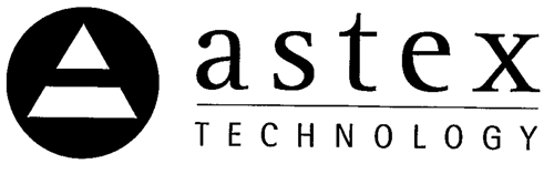
Merkenrecht. Oppositieprocedure op grond van eerder gemeenschapswoordmerk ASTEX, voor, kort gezegd, huisstofmijtbestrijdingsmiddelen, tegen aanvraag gemeenschapsbeeldmerk astex TECHNOLOGY, voor pharmaceutische producten. Oppositie toegewezen. Hoge graad van overeenstemming van de tekens neutraliseert de lage graad van soortgelijkheid met betrekking tot de waren.
“57. From a visual point of view, with regard to whether the word ‘astex’ is likely on its own to dominate the image of the trade mark which the relevant public will recall and thus constitute the dominant element of the mark applied for, it must be pointed out that it occupies a central position in that mark and that the letters composing it are significantly larger than those employed for the word ‘technology’. The Court agrees with the analysis of the Board of Appeal that the word element ‘technology’ in the mark applied for, written in much smaller typeface, will not attract consumers’ attention. Although it is true that the figurative element representing a stylised letter ‘a’ is placed very visibly on the left of the sign applied for, it does not, however, seem likely to attract the consumer’s attention to the point that he would recall it. It is unlikely that the relevant public would notice in all cases that this figurative element represents the letter ‘a’ since the image is stylised and could be confused with a triangle or an object in the form of a pyramid, all the more so as the letter ‘a’ of the word element ‘astex’ is also present in the word element of the mark applied for and thus seems redundant. In addition, the letter ‘a’, stylised in triangular form and presented in the middle of a circle, is not a special or original configuration which could lead to the identical nature of the common word element dominating the two marks being reduced to such an extent that the overall impression provided by each sign is different. Consequently, the word element ‘technology’ and the letter ‘a’ must be regarded as negligible.
(…) 59. Finally, with regard to the assessment of conceptual similarity, it is true, as the applicant claims, that the Board of Appeal did not take account of the conceptual value of the stylised element in the figurative mark applied for. The Board of Appeal merely denied the semantic value of the term ‘astex’ and denied that the word ‘technology’ had a distinctive character.
60. The Board of Appeal’s analysis is none the less well founded. The concept of technology, to which the word element ‘technology’ refers, is commonly defined very broadly, as meaning the development and perfection of methods permitting the effective use of various techniques with a view to making production, consumption and information mechanisms function. It is thus certain that, in regard to all the goods covered by the trade mark application, the reference to technology is not of such a nature as to give the mark applied for a distinctive character.
(….) 62. Only the stylised element could call into question the conceptual similarity of the signs at issue. It is sufficient to note, in that regard, that the significance of that element is far from clear, inasmuch as it may be regarded as a stylised letter ‘a’ or, equally, as a triangle or an object in the form of a pyramid. Moreover, the applicant does not express a view as to the significance to be accorded to the figurative element.
63. Consequently, the signs at issue must be regarded as being very similar overall.
(…) 70. In the present case, bearing in mind the distinctive character of the earlier mark resulting from the use of an original term which has no precise meaning in any language of the European Community, something which the applicant does not contest, the Board of Appeal rightly considered that the high degree of similarity between the signs at issue was such as to offset the low degree of similarity between the goods at issue.
71. In particular, the similar intended purpose of the products, both of which are of interest to persons suffering from respiratory problems related to allergic reactions to dust mites, and the high degree of similarity between the marks at issue, justify the Board of Appeal’s assessment that the relevant public is likely to believe that the goods bearing the signs at issue come from the same undertaking or from undertakings that are economically linked.
72. In the light of the foregoing, it must be held that the Board of Appeal was right to conclude that there was a likelihood of confusion between the two marks at issue."
Lees het arrest hier.


